Basic Barplot with plotnine
This vignette shows how to create a basic barplot using plotnine. A barplot displays the relationship between a numeric variable and a categorical variable.
This example is a plotnine port of the Basic Barplot tutorial from the Python Graph Gallery, which originally uses matplotlib.
Libraries & Dataset
We use pandas to hold the data and plotnine_extra (which re-exports the full plotnine API) for plotting.
[1]:
import pandas as pd
from plotnine import (
    ggplot,
    aes,
    geom_col,
    labs,
    theme_minimal,
)

# Create the dataset (same data as the original matplotlib example)
df = pd.DataFrame({
    "category": ["A", "B", "C", "D", "E"],
    "height": [3, 12, 5, 18, 45],
})
Basic Barplot
With plotnine we build plots using the grammar of graphics:
``ggplot(df, aes(…))`` – bind the data and map columns to aesthetics.
``geom_col()`` – draw a bar whose height equals the value in the data (use
geom_bar()when you want plotnine to count rows for you).
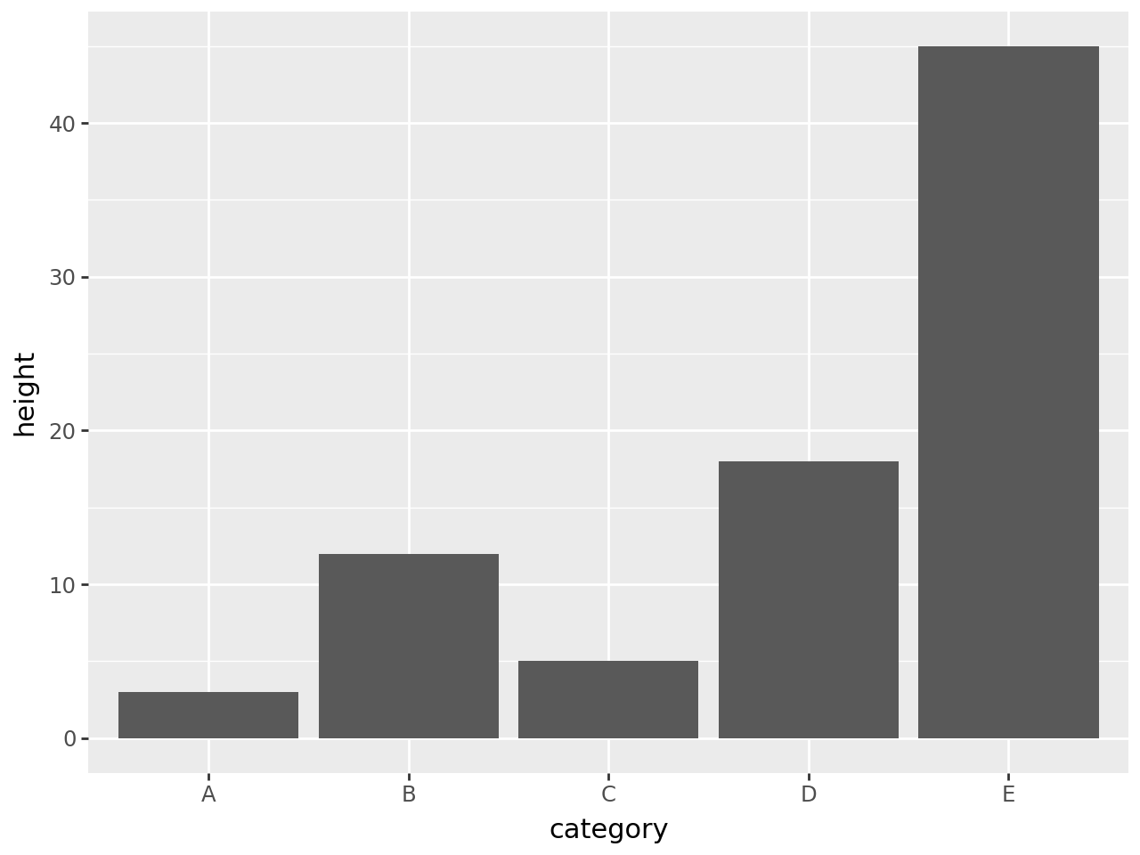
[2]:
(
    ggplot(df, aes(x="category", y="height"))
    + geom_col()
)
[2]:
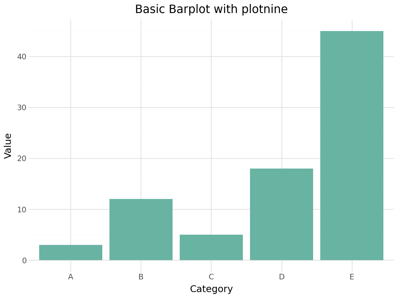
Customising the plot
plotnine makes it easy to polish the appearance. Below we add a colour fill, labels, and a cleaner theme.
[3]:
(
    ggplot(df, aes(x="category", y="height"))
    + geom_col(fill="#69b3a2")
    + labs(
        title="Basic Barplot with plotnine",
        x="Category",
        y="Value",
    )
    + theme_minimal()
)
[3]:
Going further
Because plotnine implements the grammar of graphics, extending this basic example is straightforward:
Map
fillto a column to get grouped / stacked bars.Use
coord_flip()for horizontal bars.Add error bars with
geom_errorbar().Facet with
facet_wrap()orfacet_grid().
See the plotnine documentation and the plotnine-extra API reference for more details.