Beeswarm Plots with plotnine-extra
This vignette shows how to create beeswarm plots using plotnine-extra. Beeswarm plots are a way of displaying the distribution of data points along a categorical axis. Unlike a simple jitter plot, points are arranged so that they never overlap, giving a faithful view of the underlying data distribution while showing every individual observation.
plotnine-extra provides two geoms ported from the R package ggbeeswarm:
geom_beeswarm()– the classic beeswarm layout.geom_quasirandom()– density-aware quasi-random jitter.
Libraries & Dataset
We use the classic Iris dataset which contains measurements for three species of iris flowers.
[1]:
from plotnine_extra import (
    ggplot,
    aes,
    geom_beeswarm,
    geom_quasirandom,
    geom_boxplot,
    geom_violin,
    labs,
    theme_minimal,
    scale_color_brewer,
    scale_fill_brewer,
    coord_flip,
    guides,
    guide_legend,
)
from plotnine_extra.data import iris

iris.head()
[1]:
| sepal_length | sepal_width | petal_length | petal_width | species | |
|---|---|---|---|---|---|
| 0 | 5.1 | 3.5 | 1.4 | 0.2 | setosa |
| 1 | 4.9 | 3.0 | 1.4 | 0.2 | setosa |
| 2 | 4.7 | 3.2 | 1.3 | 0.2 | setosa |
| 3 | 4.6 | 3.1 | 1.5 | 0.2 | setosa |
| 4 | 5.0 | 3.6 | 1.4 | 0.2 | setosa |
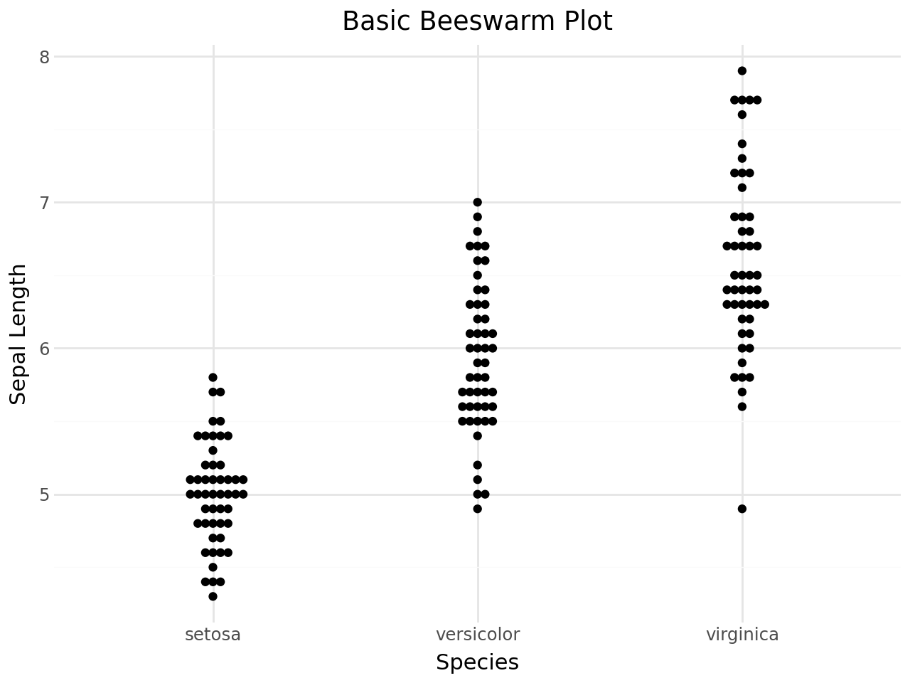
Basic beeswarm plot
The simplest beeswarm plot maps a categorical variable to x and a continuous variable to y. Points are shifted sideways just enough to avoid overlap.
[2]:
(
    ggplot(iris, aes(x="species", y="sepal_length"))
    + geom_beeswarm()
    + labs(
        title="Basic Beeswarm Plot",
        x="Species",
        y="Sepal Length",
    )
    + theme_minimal()
)
[2]:
Coloring by group
Map the color aesthetic to the grouping variable to distinguish species.
[3]:
(
    ggplot(iris, aes(x="species", y="sepal_length", color="species"))
    + geom_beeswarm(size=2)
    + scale_color_brewer(type="qual", palette="Set2")
    + labs(
        title="Beeswarm with Color by Species",
        x="Species",
        y="Sepal Length",
    )
    + theme_minimal()
)
[3]:

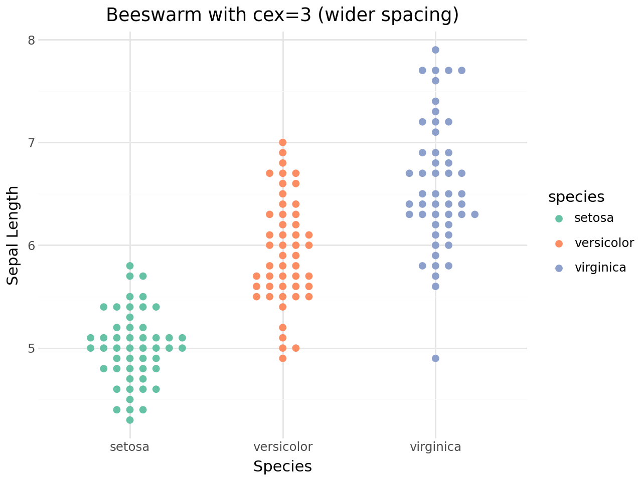
The cex parameter
The cex parameter controls the spacing between points. Higher values spread points further apart, lower values pack them more tightly.
[4]:
(
    ggplot(iris, aes(x="species", y="sepal_length", color="species"))
    + geom_beeswarm(cex=3, size=2)
    + scale_color_brewer(type="qual", palette="Set2")
    + labs(
        title="Beeswarm with cex=3 (wider spacing)",
        x="Species",
        y="Sepal Length",
    )
    + theme_minimal()
)
[4]:
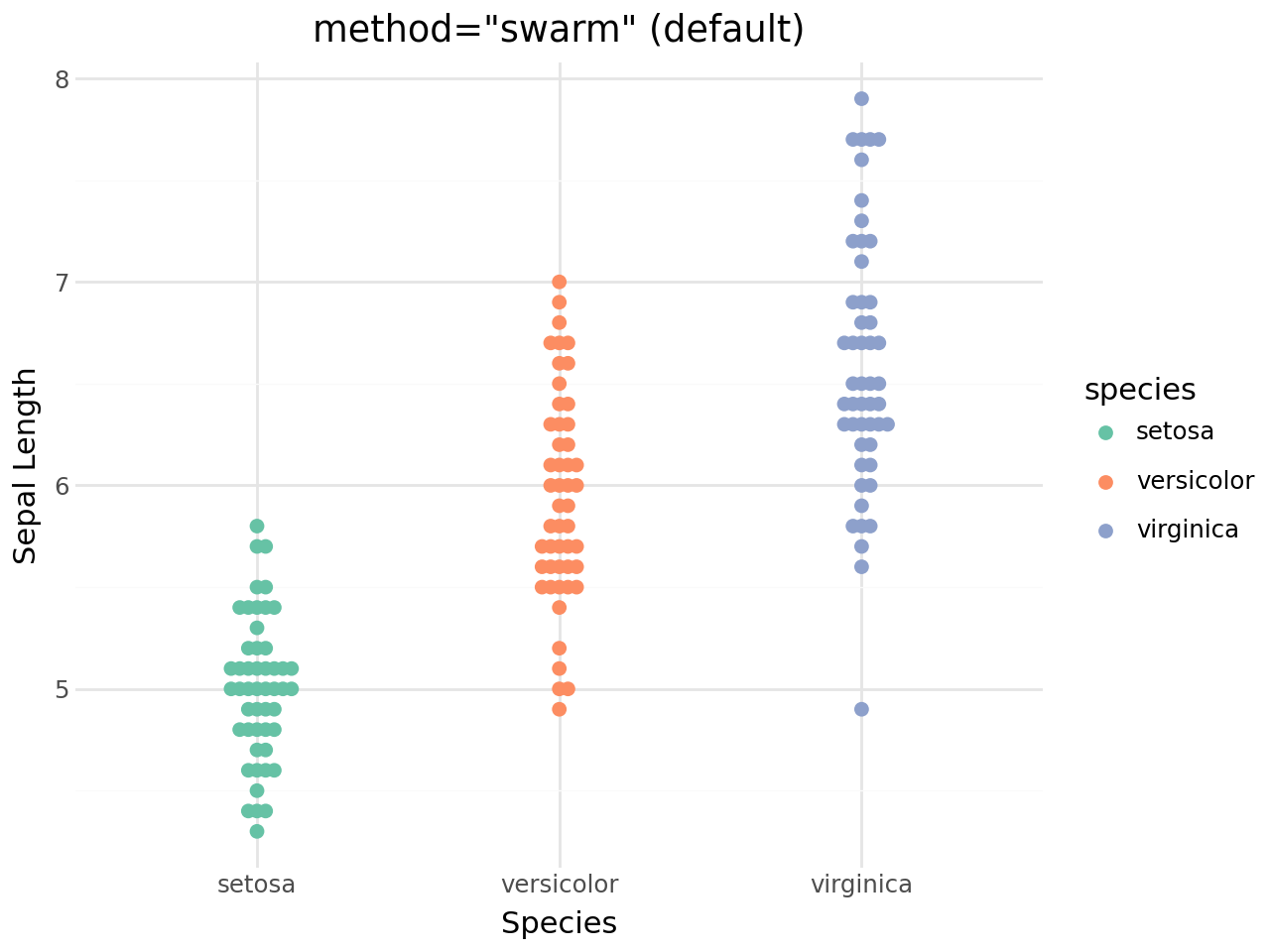
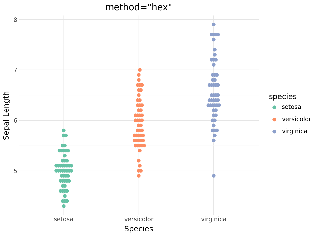
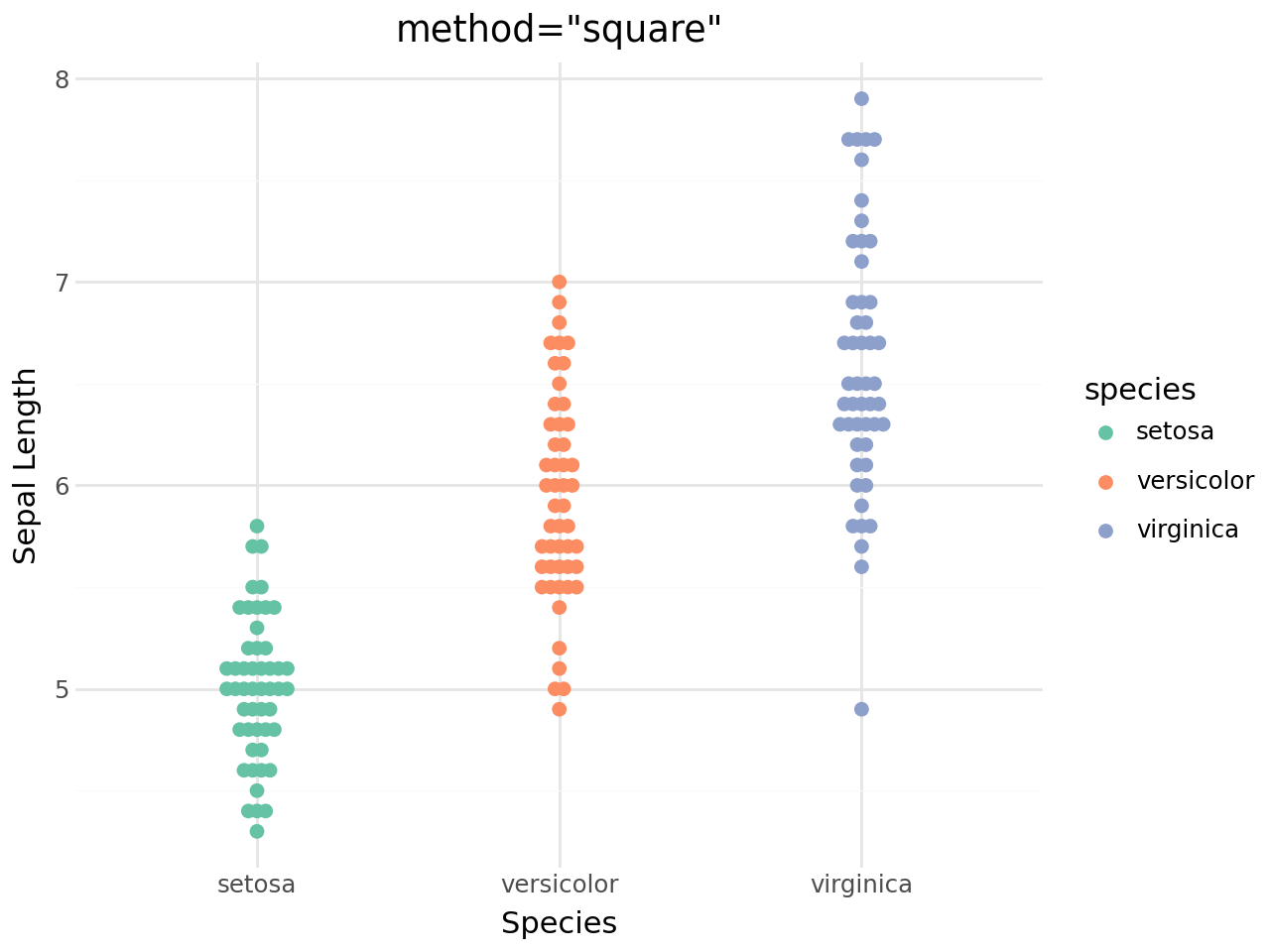
Beeswarm methods
geom_beeswarm() supports five layout methods:
Method |
Description |
|---|---|
|
Default – shifts points sideways to avoid overlap |
|
Tighter packing variant |
|
Square grid, centred |
|
Hexagonal grid |
|
Regular square grid |
[5]:
(
    ggplot(iris, aes(x="species", y="sepal_length", color="species"))
    + geom_beeswarm(method="swarm", size=2)
    + scale_color_brewer(type="qual", palette="Set2")
    + labs(
        title='method="swarm" (default)',
        x="Species",
        y="Sepal Length",
    )
    + theme_minimal()
)
[5]:
[6]:
(
    ggplot(iris, aes(x="species", y="sepal_length", color="species"))
    + geom_beeswarm(method="center", size=2)
    + scale_color_brewer(type="qual", palette="Set2")
    + labs(
        title='method="center"',
        x="Species",
        y="Sepal Length",
    )
    + theme_minimal()
)
[6]:

[7]:
(
    ggplot(iris, aes(x="species", y="sepal_length", color="species"))
    + geom_beeswarm(method="hex", size=2)
    + scale_color_brewer(type="qual", palette="Set2")
    + labs(
        title='method="hex"',
        x="Species",
        y="Sepal Length",
    )
    + theme_minimal()
)
[7]:
[8]:
(
    ggplot(iris, aes(x="species", y="sepal_length", color="species"))
    + geom_beeswarm(method="square", size=2)
    + scale_color_brewer(type="qual", palette="Set2")
    + labs(
        title='method="square"',
        x="Species",
        y="Sepal Length",
    )
    + theme_minimal()
)
[8]:
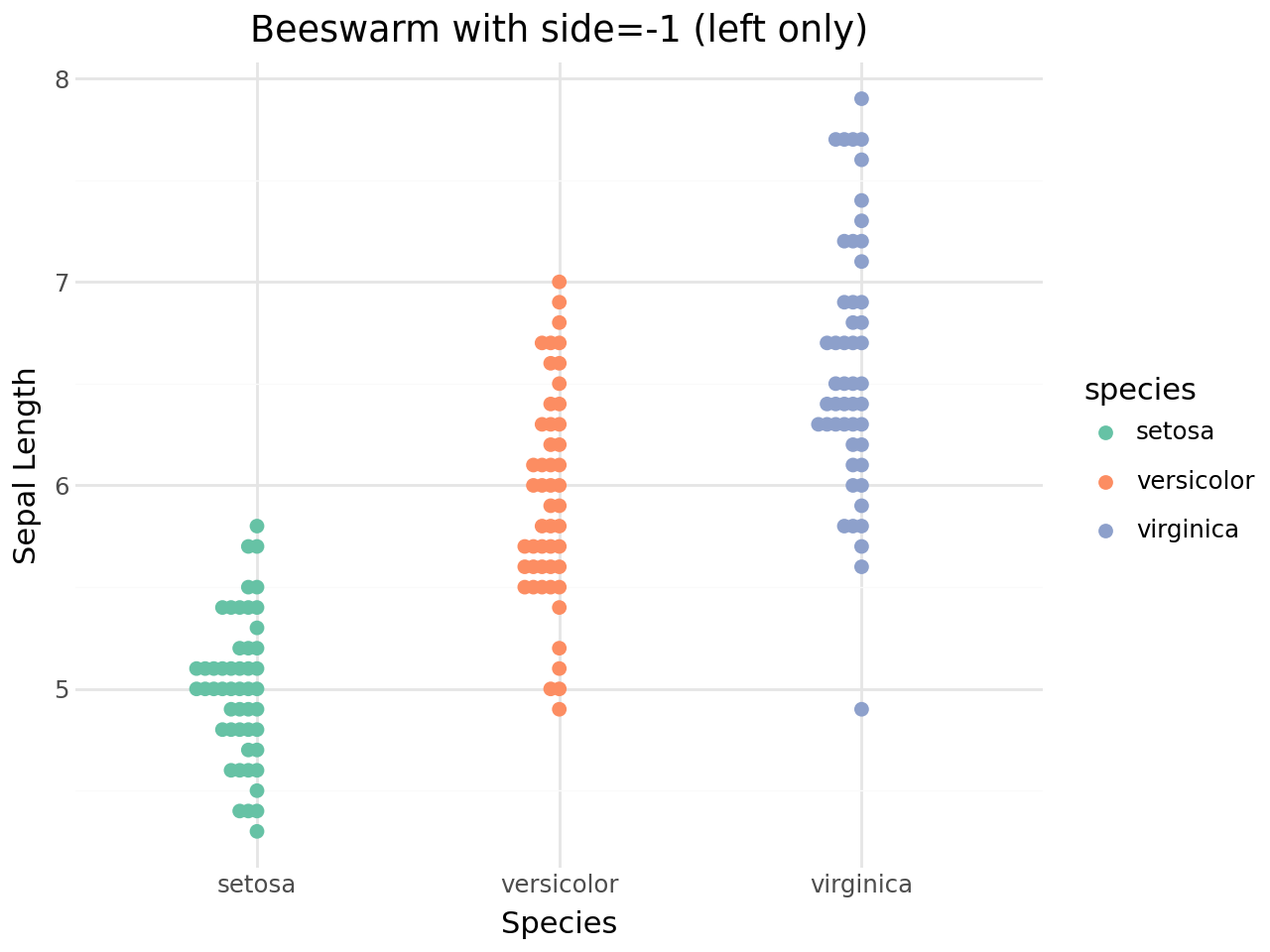
Side control
The side parameter determines whether points are spread to both sides of the centre line or to one side only:
side=0– both sides (default)side=1– right / up onlyside=-1– left / down only
[9]:
(
    ggplot(iris, aes(x="species", y="sepal_length", color="species"))
    + geom_beeswarm(side=1, size=2)
    + scale_color_brewer(type="qual", palette="Set2")
    + labs(
        title="Beeswarm with side=1 (right only)",
        x="Species",
        y="Sepal Length",
    )
    + theme_minimal()
)
[9]:

[10]:
(
    ggplot(iris, aes(x="species", y="sepal_length", color="species"))
    + geom_beeswarm(side=-1, size=2)
    + scale_color_brewer(type="qual", palette="Set2")
    + labs(
        title="Beeswarm with side=-1 (left only)",
        x="Species",
        y="Sepal Length",
    )
    + theme_minimal()
)
[10]:
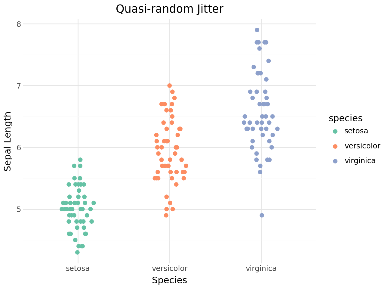
Quasi-random jitter
geom_quasirandom() uses a density-aware quasi-random sequence to jitter points. The result looks like a violin plot but shows every individual observation.
[11]:
(
    ggplot(iris, aes(x="species", y="sepal_length", color="species"))
    + geom_quasirandom(size=2)
    + scale_color_brewer(type="qual", palette="Set2")
    + labs(
        title="Quasi-random Jitter",
        x="Species",
        y="Sepal Length",
    )
    + theme_minimal()
)
[11]:
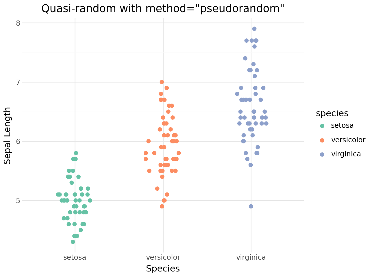
Pseudorandom method
Set method="pseudorandom" for uniform random jitter instead of the quasi-random van der Corput sequence.
[12]:
(
    ggplot(iris, aes(x="species", y="sepal_length", color="species"))
    + geom_quasirandom(method="pseudorandom", size=2)
    + scale_color_brewer(type="qual", palette="Set2")
    + labs(
        title='Quasi-random with method="pseudorandom"',
        x="Species",
        y="Sepal Length",
    )
    + theme_minimal()
)
[12]:
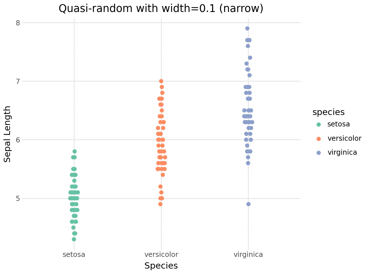
Controlling the jitter width
The width parameter sets the maximum horizontal spread.
[13]:
(
    ggplot(iris, aes(x="species", y="sepal_length", color="species"))
    + geom_quasirandom(width=0.1, size=2)
    + scale_color_brewer(type="qual", palette="Set2")
    + labs(
        title="Quasi-random with width=0.1 (narrow)",
        x="Species",
        y="Sepal Length",
    )
    + theme_minimal()
)
[13]:
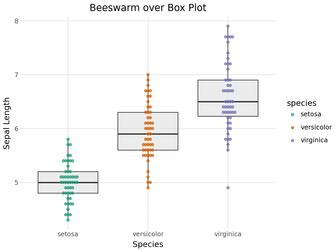
Combining with other geoms
Beeswarm points work well layered on top of box plots or violin plots to show both the summary statistics and the raw data.
Beeswarm + Box plot
[14]:
(
    ggplot(iris, aes(x="species", y="sepal_length"))
    + geom_boxplot(outlier_shape="", fill="#e0e0e0", alpha=0.6)
    + geom_beeswarm(aes(color="species"), size=1.5, alpha=0.7)
    + scale_color_brewer(type="qual", palette="Dark2")
    + labs(
        title="Beeswarm over Box Plot",
        x="Species",
        y="Sepal Length",
    )
    + theme_minimal()
)
[14]:
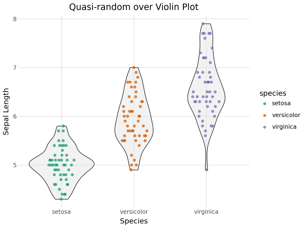
Quasi-random + Violin plot
[15]:
(
    ggplot(iris, aes(x="species", y="sepal_length"))
    + geom_violin(fill="#e0e0e0", alpha=0.4)
    + geom_quasirandom(aes(color="species"), size=1.5, alpha=0.7)
    + scale_color_brewer(type="qual", palette="Dark2")
    + labs(
        title="Quasi-random over Violin Plot",
        x="Species",
        y="Sepal Length",
    )
    + theme_minimal()
)
[15]:
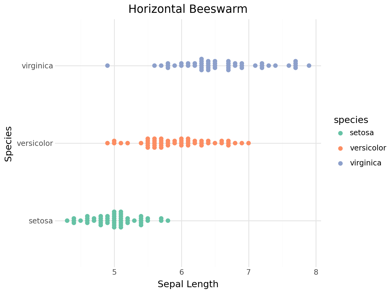
Horizontal beeswarm
Use coord_flip() to produce a horizontal beeswarm plot.
[16]:
(
    ggplot(iris, aes(x="species", y="sepal_length", color="species"))
    + geom_beeswarm(size=2)
    + scale_color_brewer(type="qual", palette="Set2")
    + coord_flip()
    + labs(
        title="Horizontal Beeswarm",
        x="Species",
        y="Sepal Length",
    )
    + theme_minimal()
)
[16]:
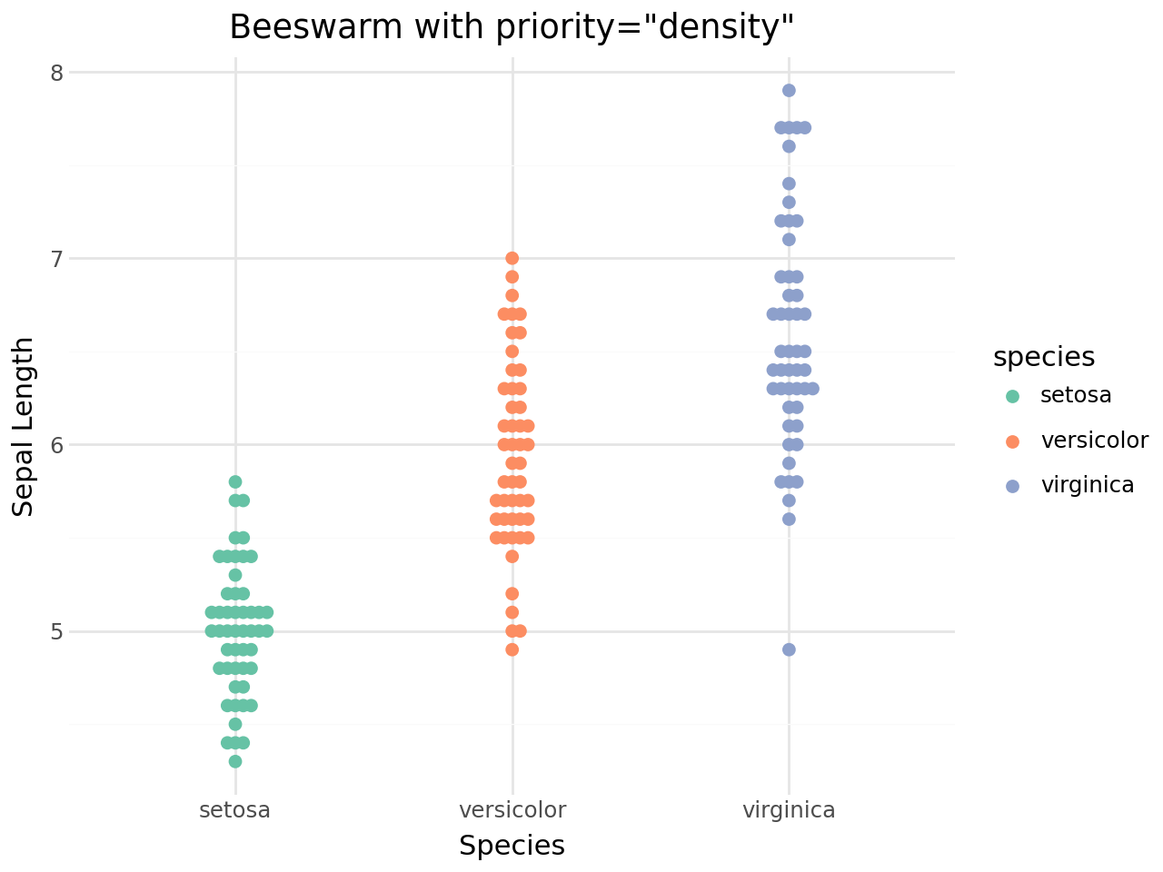
Priority ordering
The priority parameter controls the order in which points are placed in the swarm. This affects the final shape:
Priority |
Description |
|---|---|
|
Points placed from smallest to largest (default) |
|
Points placed from largest to smallest |
|
Dense regions placed first |
|
Random placement order |
|
Data order preserved |
[17]:
(
    ggplot(iris, aes(x="species", y="sepal_length", color="species"))
    + geom_beeswarm(priority="density", size=2)
    + scale_color_brewer(type="qual", palette="Set2")
    + labs(
        title='Beeswarm with priority="density"',
        x="Species",
        y="Sepal Length",
    )
    + theme_minimal()
)
[17]:
Corral (handling runaway points)
When groups are very dense, some points may extend far from the group centre. The corral parameter offers several strategies to rein them in:
Corral |
Description |
|---|---|
|
No correction (default) |
|
Clamp to corral boundary |
|
Wrap periodically |
|
Random placement within corral |
|
Remove runaway points |
[18]:
(
    ggplot(iris, aes(x="species", y="sepal_length", color="species"))
    + geom_beeswarm(corral="gutter", corral_width=0.4, size=2)
    + scale_color_brewer(type="qual", palette="Set2")
    + labs(
        title='Beeswarm with corral="gutter"',
        x="Species",
        y="Sepal Length",
    )
    + theme_minimal()
)
[18]:

Summary
Key takeaways:
geom_beeswarm()arranges points to avoid overlap while faithfully showing the data distribution.geom_quasirandom()produces a violin-like point cloud using density-aware quasi-random jitter.Both geoms accept all standard
geom_point()aesthetics (color,size,alpha,shape, etc.).Combine with
geom_boxplot()orgeom_violin()for summary + raw-data views.Use
cex,side,priority,method, andcorralto fine-tune the layout.