Pairwise Comparisons with stat_pwc
This vignette demonstrates how to use stat_pwc to add pairwise comparison p-values to plots, similar to ggpubr’s ``geom_pwc` <https://rpkgs.datanovia.com/ggpubr/reference/geom_pwc.html>`__.
stat_pwc performs pairwise statistical tests (t-test, Wilcoxon) between groups and displays the results as bracket annotations with p-values. It supports:
All pairwise combinations
Comparisons against a reference group
Explicit comparison pairs
Multiple p-value adjustment methods (Bonferroni, Holm, BH, etc.)
Various label formats (p-value, significance stars)
Setup
[1]:
import numpy as np
import pandas as pd
from plotnine import (
    aes,
    geom_boxplot,
    geom_jitter,
    geom_point,
    ggplot,
    labs,
    scale_y_continuous,
    theme_minimal,
    facet_wrap,
)
from plotnine_extra import stat_pwc
Data Preparation
We use a dataset inspired by R’s ToothGrowth dataset, which records tooth length (len) across different supplement types (supp) and dose levels (dose).
[2]:
np.random.seed(42)

# Create a ToothGrowth-like dataset
df = pd.DataFrame({
    "dose": np.tile(np.repeat(["D0.5", "D1", "D2"], 10), 2),
    "supp": np.repeat(["OJ", "VC"], 30),
    "len": np.concatenate([
        # OJ groups
        np.random.normal(13, 4, 10),  # OJ, dose 0.5
        np.random.normal(23, 3, 10),  # OJ, dose 1
        np.random.normal(26, 2, 10),  # OJ, dose 2
        # VC groups
        np.random.normal(8, 3, 10),   # VC, dose 0.5
        np.random.normal(17, 4, 10),  # VC, dose 1
        np.random.normal(26, 3, 10),  # VC, dose 2
    ]),
})

df.head()
[2]:
| dose | supp | len | |
|---|---|---|---|
| 0 | D0.5 | OJ | 14.986857 |
| 1 | D0.5 | OJ | 12.446943 |
| 2 | D0.5 | OJ | 15.590754 |
| 3 | D0.5 | OJ | 19.092119 |
| 4 | D0.5 | OJ | 12.063387 |
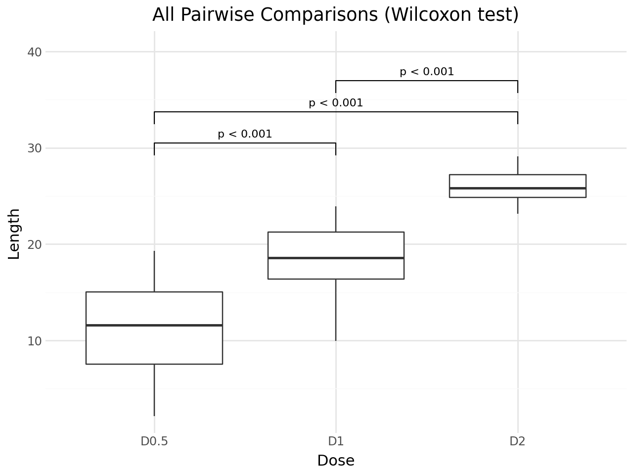
Basic Usage: All Pairwise Comparisons
By default, stat_pwc performs all pairwise comparisons between x-axis groups using the Wilcoxon rank-sum test (Mann-Whitney U). The default geom is geom_bracket, which draws brackets with p-value labels.
[3]:
(
    ggplot(df, aes(x="dose", y="len"))
    + geom_boxplot()
    + stat_pwc()
    + scale_y_continuous(expand=(0.05, 0, 0.15, 0))
    + labs(
        title="All Pairwise Comparisons (Wilcoxon test)",
        x="Dose",
        y="Length",
    )
    + theme_minimal()
)
[3]:
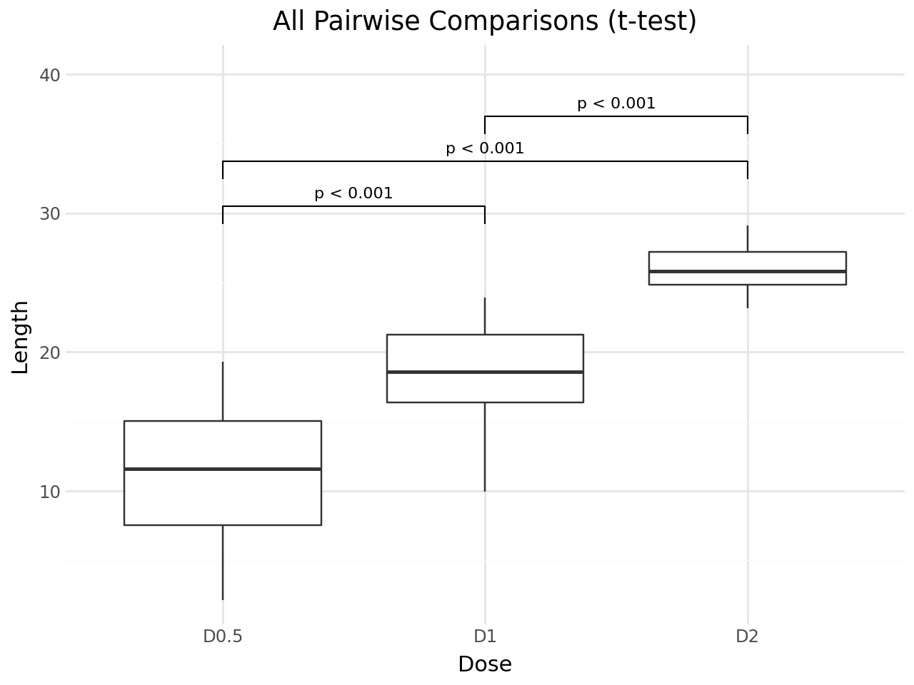
Using t-test Instead of Wilcoxon
Set method="t.test" to use the independent samples t-test.
[4]:
(
    ggplot(df, aes(x="dose", y="len"))
    + geom_boxplot()
    + stat_pwc(method="t.test")
    + scale_y_continuous(expand=(0.05, 0, 0.15, 0))
    + labs(
        title="All Pairwise Comparisons (t-test)",
        x="Dose",
        y="Length",
    )
    + theme_minimal()
)
[4]:
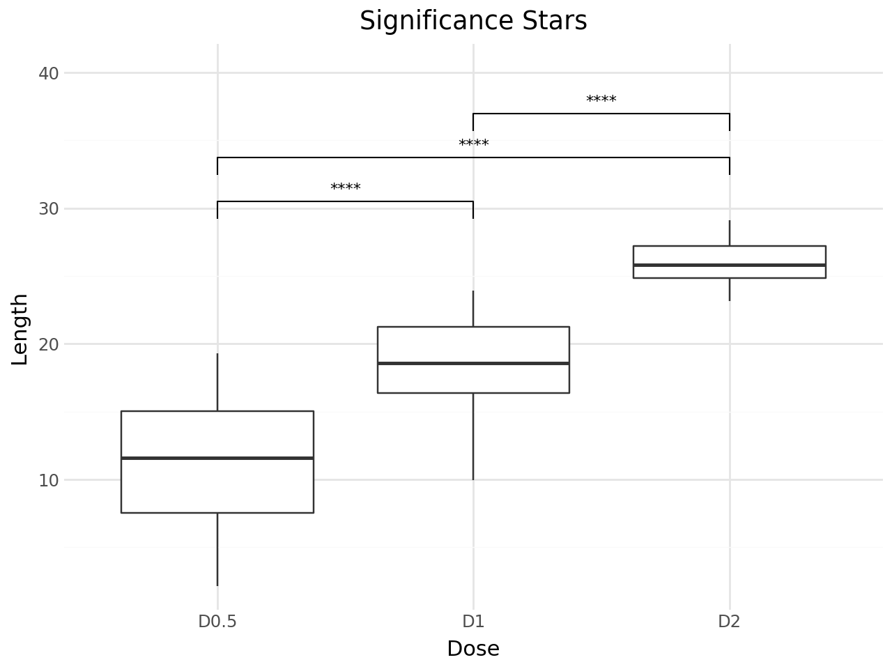
Significance Stars
Use label="p.signif" to display significance stars instead of p-values. The convention is:
Symbol |
Meaning |
|---|---|
|
p > 0.05 |
|
p ≤ 0.05 |
|
p ≤ 0.01 |
|
p ≤ 0.001 |
|
p ≤ 0.0001 |
[5]:
(
    ggplot(df, aes(x="dose", y="len"))
    + geom_boxplot()
    + stat_pwc(label="p.signif")
    + scale_y_continuous(expand=(0.05, 0, 0.15, 0))
    + labs(
        title="Significance Stars",
        x="Dose",
        y="Length",
    )
    + theme_minimal()
)
[5]:
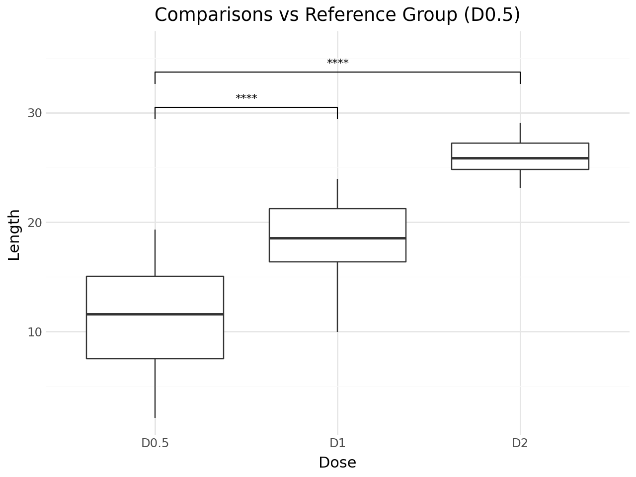
Comparisons Against a Reference Group
Use ref_group to compare each group against a reference. This is useful for comparing treatment groups against a control.
[6]:
(
    ggplot(df, aes(x="dose", y="len"))
    + geom_boxplot()
    + stat_pwc(
        ref_group="D0.5",
        label="p.signif",
        method="t.test",
    )
    + scale_y_continuous(expand=(0.05, 0, 0.12, 0))
    + labs(
        title='Comparisons vs Reference Group (D0.5)',
        x="Dose",
        y="Length",
    )
    + theme_minimal()
)
[6]:
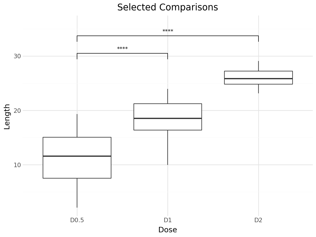
Explicit Comparison Pairs
Specify exactly which pairs to compare with the comparisons parameter.
[7]:
(
    ggplot(df, aes(x="dose", y="len"))
    + geom_boxplot()
    + stat_pwc(
        comparisons=[("D0.5", "D1"), ("D0.5", "D2")],
        label="p.signif",
    )
    + scale_y_continuous(expand=(0.05, 0, 0.12, 0))
    + labs(
        title="Selected Comparisons",
        x="Dose",
        y="Length",
    )
    + theme_minimal()
)
[7]:
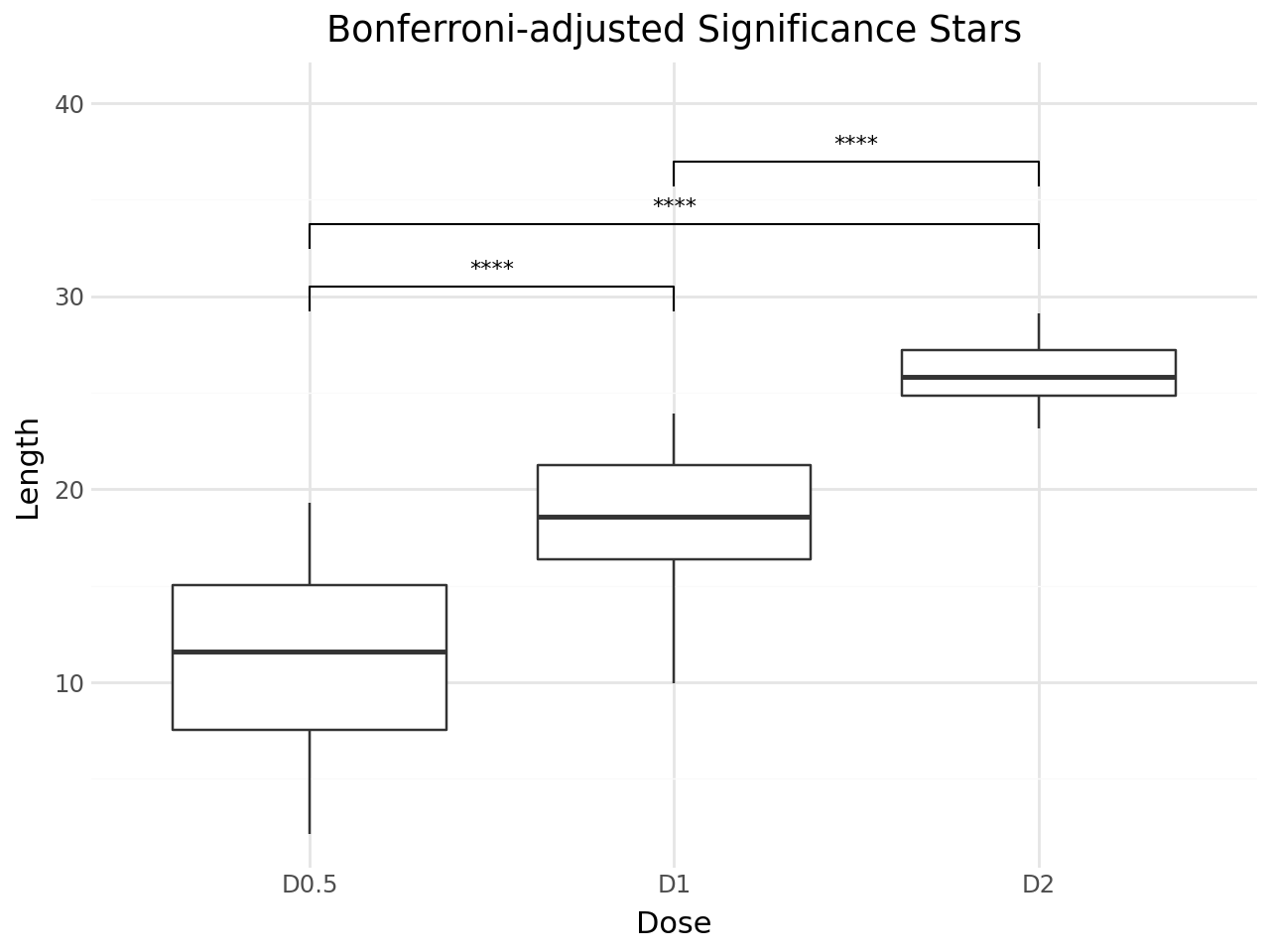
P-value Adjustment
stat_pwc adjusts p-values for multiple comparisons by default using the Holm method. You can change the adjustment method with p_adjust_method.
Use label="p.adj.format" to display adjusted p-values, or label="p.adj.signif" for adjusted significance stars.
[8]:
(
    ggplot(df, aes(x="dose", y="len"))
    + geom_boxplot()
    + stat_pwc(
        label="p.adj.signif",
        p_adjust_method="bonferroni",
        method="t.test",
    )
    + scale_y_continuous(expand=(0.05, 0, 0.15, 0))
    + labs(
        title="Bonferroni-adjusted Significance Stars",
        x="Dose",
        y="Length",
    )
    + theme_minimal()
)
[8]:
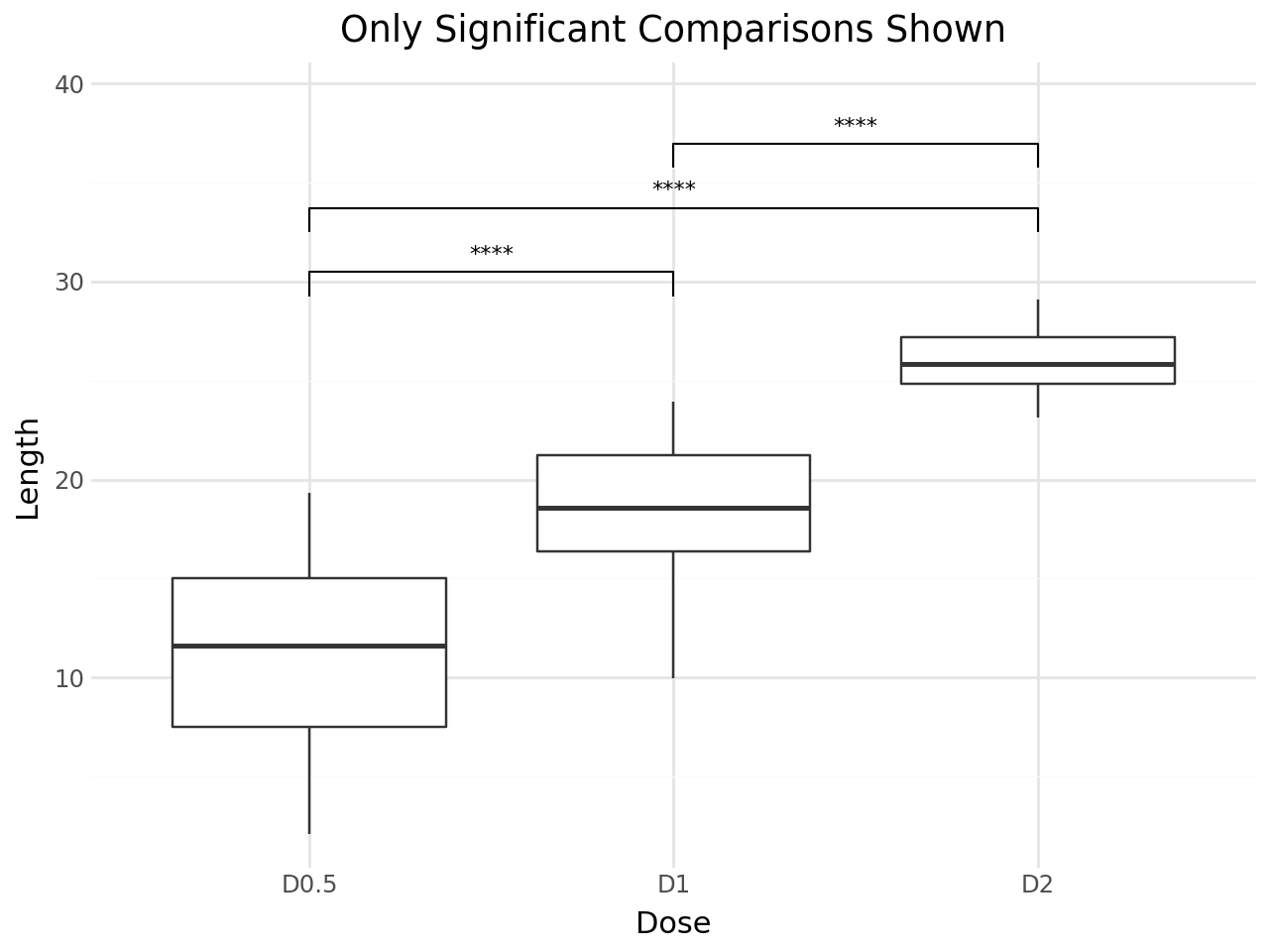
Hiding Non-significant Comparisons
Set hide_ns=True to remove non-significant comparisons (p > 0.05) from the plot.
[9]:
(
    ggplot(df, aes(x="dose", y="len"))
    + geom_boxplot()
    + stat_pwc(
        label="p.signif",
        hide_ns=True,
    )
    + scale_y_continuous(expand=(0.05, 0, 0.12, 0))
    + labs(
        title="Only Significant Comparisons Shown",
        x="Dose",
        y="Length",
    )
    + theme_minimal()
)
[9]:
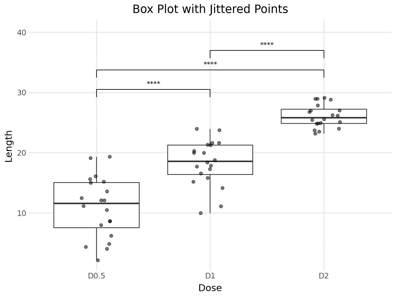
Box Plot with Jittered Points
stat_pwc works with any geom. Here we combine box plots with jittered data points for a richer visualization.
[10]:
(
    ggplot(df, aes(x="dose", y="len"))
    + geom_boxplot(outlier_shape="")
    + geom_jitter(width=0.15, alpha=0.5)
    + stat_pwc(
        method="t.test",
        label="p.signif",
    )
    + scale_y_continuous(expand=(0.05, 0, 0.15, 0))
    + labs(
        title="Box Plot with Jittered Points",
        x="Dose",
        y="Length",
    )
    + theme_minimal()
)
[10]:
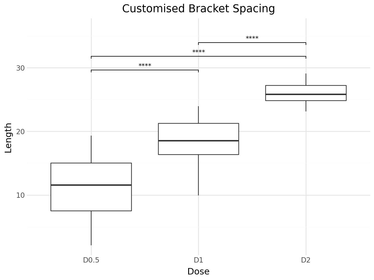
Customising Bracket Appearance
You can adjust the bracket layout with:
step_increase– gap between stacked brackets (fraction of y-range)bracket_nudge_y– vertical offset for all bracketstip_length– length of bracket tips
[11]:
(
    ggplot(df, aes(x="dose", y="len"))
    + geom_boxplot()
    + stat_pwc(
        label="p.signif",
        step_increase=0.08,
        bracket_nudge_y=0.02,
        tip_length=0.01,
    )
    + scale_y_continuous(expand=(0.05, 0, 0.12, 0))
    + labs(
        title="Customised Bracket Spacing",
        x="Dose",
        y="Length",
    )
    + theme_minimal()
)
[11]:
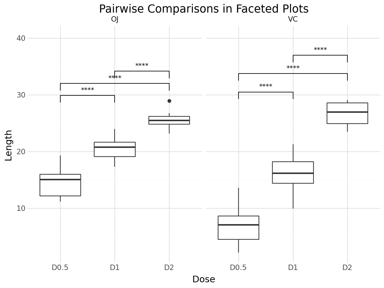
Faceted Plots
stat_pwc works with faceted plots. Each facet panel gets its own set of pairwise comparisons.
[12]:
(
    ggplot(df, aes(x="dose", y="len"))
    + geom_boxplot()
    + stat_pwc(
        label="p.signif",
        method="t.test",
    )
    + facet_wrap("supp")
    + scale_y_continuous(expand=(0.05, 0, 0.15, 0))
    + labs(
        title="Pairwise Comparisons in Faceted Plots",
        x="Dose",
        y="Length",
    )
    + theme_minimal()
)
[12]:
Available Label Formats
|
Description |
|---|---|
|
Formatted raw p-value (default) |
|
Significance symbols (ns, *, **, ***, ****) |
|
Formatted adjusted p-value |
|
Adjusted significance symbols |
|
Raw p-value with significance symbol |
Available P-value Adjustment Methods
|
Description |
|---|---|
|
Holm (default, step-down) |
|
Bonferroni |
|
Hochberg |
|
Benjamini-Hochberg (FDR) |
|
Benjamini-Yekutieli |
|
Hommel |
|
No adjustment |
Summary
stat_pwc makes it easy to add statistical comparison annotations to any plotnine chart. Key features:
Automatic pairwise testing between all groups, or against a reference group
Multiple test methods: Wilcoxon rank-sum (default) and t-test
P-value adjustment for multiple comparisons
Flexible labelling: p-values, significance stars, or both
Bracket customisation: spacing, tips, and nudging
Works with facets — each panel gets its own comparisons
For more details, see the API reference.